Research into broadcasting companies; Film4

 During our production, we thought of not only box offices distributing our movie, but TV networks and channels having access to our movie's rights.
I looked at channels such as Film4 and BBC Films to own rights to our film and also giving them the right to broadcast our film after it's box office release as network premieres.
Film4, previously known as Channel For Films, or FilmFour International is a British film production company owned by TV broadcasters Channel 4.
Film4 used to show only a specific genre of films which were indie-films and did not really focus on broadcasting Blockbusters, but has recently conformed to showing Hollywood Blockbusters.
Film4 are popular for their themed nights which could focus on a specific genre of movies, an actor or director that stars or has directed the film.

Film 4 has it's own production team Film4 Productions, which has aided the making of several successful films such as "Slum-dog Millionaire"
  and "The Lovely Bones".
They were a company that aided filmmakers before they became one of the largest film broadcasters in the UK. Film4 productions usually have the trademark at the beginning of it's films showing the audience that they have halped in the production of this film, even if it means added a small amount of money to it.


I thought it would be a good idea to use Film4 as a production team, if not, allow them to the rights to the movie to do interviews with the cast and give them the rights to the movie after it's box office and DVD release.
Fenetta

Audience Feedback of Finished Products

Although we uploaded our finished products on facebook and our teaser trailer on YouTube, we weren't getting enough feedback so i decided to make a quick survey consisting of 7 questions and sent it to my contacts list. With 8 people taking the survey, i have a general idea of what is thought of our finished products.


Out of 8, 5 people thought our teaser
trailer 'Lullabye' was amazing and
37.5% (3 people) thought our teaser trailer was done to a good standard. No one thought our teaser trailer was okay or rubbish and only one person wrote a response on the other category and they wrote that it

was 'quite scary' which is great as the genre of our teaser trailer is horror.


Question 2 was about our Lullabye film poster and 4 people out of the 8 have chosen that they thought it looks really good and the other 4 thou
ght it looks professional. This is very good fee
dback for us as this is the response we wanted for our film poster, we wanted it to look really good as well
as making it look as professional as possible.


This question asked what people thought about our 'The Big Scream' magazine front cover, they were given the answer choices of 'It looks professional', 'It's okay', 'It's rubbish'
or they could write what they didn't like. 75.0% of 8 people answered they thought the magazine front cover looks professional, 1 person thought it looks okay, 1 person said it's rubbish. 1 person thought that our magazine front cover could do with 'more darker/negative colours' probably to make it look more like a horror themed magazine. Another person also thought our magazine front cover was 'a bit messy and crowded'.


For the fourth question i wanted to know what scared the audience about
our teaser trailer. 4 people thought
our music was 'a little scary', 1 person thought it was 'very scary' and 1 person thought 'not scary at all', this shows that the music was a overall success as it was scary enough to fit into the teaser trailer.
People thought the character looked the most scariest with 42.9% selecting 'very scary', i think people thought the character looked very scary due to the resemblance to popular J-horror movies such as 'Ring' and 'The Grudge'. The costume was also classed as scary with 71.4% of people thinking it looks 'pretty scary', this could show that the costume is scary due to it looking like an olden day dress. The title was difficult to say whether people thought it was scary or not, with 2 people thinking it looks 'very scary' and 2 people thinking it looks 'pretty scary', 2 people also thought the title looks 'not scary at all', this shows that the title received a mix reaction.
Here are some feedback on what people thought about our Lullabye film poster. We received a lot of positive feedback with people thinking
it 'was quite disturbing' which is a good due to the genre of the movie
being horror. This shows that we have made a good choice of the image we used as it is 'nice and simple' but done to a 'professional standard'.


Here i have asked what people liked about the Big Scream magazine and these are the

responses. Someone wrote that they liked 'the fact that the picture is the main focus' which we have followed the convention of on movie magazines that we have researched on the internet. Someone also wrote that they thought it was intriguing and they wanted to read on, this is the exact response we wanted for our magazine front cover as magazine front covers are supposed to lead the viewer into wanting to read more
.
As well as asking what people thought about our end products, i have also decided to ask what can be improved. This question asks what can be improved in Lullabye's teaser trailer and many people said they wanted more shots and more scenes. If we were to do it again i think we would add a variety of different scenes in it, making it more gorier and scarier to make sure it scares the audience a horror teaser trailer should.


Lucy Luu

Additional research: The BBFC

During production of our pieces, me and Lucy did more research into the media film industry and even went as far as to lookin at ways in which we could distribute our pieces of media. We did a brief brain storm and charted off all if the possible places in which we could put our trailer and media products in order for them to gain recognition and popularity. The most popular websites were Youtue, Facebook and Twitter. We looked at things such as Twitter Trending topic promotion where films and popular companies gain more popularity by paying Twitter to advertise their product or film.


This seemed like a reasonable piece of media convergence because over the last couple of years, Twitter's popularity has sky-rocketed and is almost as successful as large and extremely networking site, Facebook.
Not only did we look at websites, but we thought along the lines off "What if we actually decide to make this film, how would we distribute it?" And box office and cinema realease looked good, but once looking at film that had been released in the cinema, we saw that most of them have one thing in common, they all have age certificates.

Now, by watching a DVD of the work that the BBFC does and seeing and understand their role in the industry, we decided that although age ratings are never usually seen on the poster or magazine, they are very vital to making a film.
There are certain guidlines that must be abided by in order for a film to stay within a certain age band.
To get a 'U' (Univeral rating)
"Suitable for all ‘U’ film should be
suitable for audiences aged four
years and over. ‘U’ films should    
be set within a positive moral
framework and should offer
reassuring counterbalances to
any violence, threat or horror.
If a work is particularly suitable
for a pre-school child to view
alone, this will be indicated in
the Consumer Advice." - Quote taken from BBFC guildline booklet

And in terms of putting horror in a U film, it should be (according to the BBFC):
"Scary sequences should be mild, brief and unlikely to
cause undue anxiety to young children. The outcome
should be reassuring."

We then looked at the 12a band to see if our trailer could fit into this criteria. Me and lucy found out that 12A if for 12 year old and older and theBBFC's specific guildine for horror in a 12A film is that it can include some blood, but not substantial amounts of violence and like the U rating, should have some sort of positive outcome, if possible.

In past years, the BBFC has been scorned for allowing very violent films into the wrong bands.
For example, I read an article on The Dark Knight and that whilst it gained an amazing gross in the first week breaking a world record for largest grossing film, it also broke the record for most complaints to the BBFC in one week. "The British Board of Film Classification (BBFC) in the UK gave the movie a classification of 12A, similar to a PG-13 rating from the MPAA in the States. It means children age 12 can see the movie unaccompanied, but an adult must bring anyone under 12. For the record there’s also a 15." - News In Film article 2008 This proving that although there are guidlines against certain amounts of violence in movies, certain people have certain violence thresh-holds and are more willing to let certain things slip.

 Now, by watching some of the scariest horror movies, we found out that a lot of them have endings in which leave you uneasy and nervous, so this shows that our piece would not fit into the 12a rating because we want that same uneasy and uncomfortable feeling to be in our film.

Although we knew that when we were making our pieces of media, that we didn't want it to be for children, we still decided to look at the bands in which our pieces could fit into because true horror films are usually 18's or considerably 15's.

After a while, the ratings become self-explanatory. 15 is for any persons above the age of 15.
The BBFC's horror guidline says this for 15's: Strong threat and menace are permitted unless sadistic
or sexualised.
Now by looking at some of the J-horror pieces in which we have use as stimuli and drive, we realised that the sadist theme is common so we wouldn't be able to fit our film into that band.
Finally, we explored the 18 band and found out that our pieces would fit into here as we not only wanted our pieces to scare, we wanted to shadow the work of Sato, and we aimed to make our pieces disturbing.


Fenetta

Project finished

Although we have finished our project, this is not the end of our work as we have still yet got to plan our evalutation and post it.
In regards to the creative tasks we were asked to do, I think I speak for everyone when I say they were thoroghly enjoyed it but now it is time to do the more theory based part of our coursework and we will post progress and planning of our evaluation on here to keep you informed.

Fenetta

What I've learnt


Benjamin Acolatse
During this project, I have picked up various different and useful skills. These include:

* Lighting, Focus and Angle Adjustments– the significance of Focus and Lighting is key when recording as I discovered, and can be can one of the hardest things to keep up when shooting and recording. This requires constant adjustment between different shots and the checking of footage. Ensuring the shot is focused, aligned and the lighting is bright enough for the editing process so that every detail can be seen.

* Effective Raw Photo & video Editing – I also learnt how to edit a raw photo to a professional standard, which is important in creating a Scary movie feel. As a warm and bright photo will make the character look too realist and normal.

* Continuity Matching The Editing- within the editing process I discovered the continuity is important. And during a movie would be important to shoot the whole scene at once.

* Timing Of Shots- the timing of shots during the editing process is also very important as a Teaser trailer is very short and requires a level suspense with the editing.

Benjamin Acolatse

Photography.

Phototgraphy:
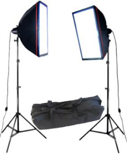
When taking images for this project i learnt how to use manual settings to a more professional degree, using the help of a light box and also using a studio setting to take my photographs. using a technique to make images have more than one meaning was my main idea.

For example, taking an image which has one side of Lucy's face dark and the other brighter, this is meant to show that she has a darkness of personality, eventhough she looks sweet, she has a split personality.

using lighting and manual settings I made the image exacatly how I wanted it to look, keeping the ISO at 200, and making the shutter speed 1/10, I used trial and error to find the best lighting which I thought suited the whole style of the genre and the actual image produced. using the lighting helped produce a more sinister feel to the whole outcome.
Also during the process of making the video, i learnt how to use final cut pro to a professional level, including cutting pieces of film up and placing them in order depending on the order the videos needed.
I also found it interesting moving for taking still images (photographs) to moving to video, I learnt that the process is very complicated, this is because you are in control of a moving image, and it is very hard to make sure everything is in order.
The first time the group filmed we took on the task with high passion and wanted to give the task our best ability possible, once we found out the complications of making sure lighting, the focus of each thing on the video, the makeup was continuously the same throughout the whole time filming the video.

Once filming for the first time, I understood how the lighting worked, for example when to use low key lighting and high key lighting, also to make sure the video was not under exposed, therefore meaning the the video would be less professional looking. Also I remembered to keep each part of the video in focus which takes patience.


After learning how to video normally to a professional level, I decided to experiment with one of the shots to create suspense for the viewers. This shot consists of making the main person in this case Lucy (dressed up as the little girl), being in the shot out of focus, with her head facing the ground, as her head moves up to look into the camera, the camera slowly goes into focus to reveal her face.

I learnt when making this video experimenting is a good thing because it makes the ideas more personal and unique, this therefore means the outcome will be more unique however fitting the normal horror teaser conventions.
Also taking "RAW" images I learnt how to convert the images in to 'JPEG, this therefore meant it was the correct


Lauren Lawlor

Final Poster


This is the final outcome of our film poster titled 'Lullabye'. As you can see, when you look at the original draft of the poster and the one created in Adobe Photoshop CS3, it looks very different. When trying to re-create the original draft in Photoshop i started off with the title which i created simply using the pencil tool and drew each and every line individually. I did the lines individually and layered them over each other as this gave it an interesting look, making it look scratchy as i originally planned. The title of the movie moved from the top
of the poster to the bottom as when researching horror movies, most of them had titles which were at the bottom of the poster so we wanted to continue that connotation and moved our title.

The image used in our final outcome poster and our draft poster is completely different, this is because when we were taking photos we didn't take any that were similar to the draft or if there were any similar then they didn't show the
whole body (e.g. the feet) so we decided to choose a image which would look just as good yet continuing the idea of not revealing her identity to the audience. I think the choice of the image fits the poster well as it still carries that
black empty surrounding around her just like the original draft i drew.
Overall i think the film poster is a success as it follows the conventions of a horror movie. The colours used in the poster are dark and sinister and it creates a sense of fear.

Here i have created a Japanese version of our final film poster due to our teaser trailer "Lullabye" relating to J-horror. By using Goggle translator i simply typed in 'Lullabye' and it came up with Japanese symbols which i then put into Adobe Photoshop to put it in the right place. I did the same thing with the slogan. We wanted to make a Japanese version of our final poster hoping it would be popular in Japan and link to the Japanese horror genre of movies.

Whilst browsing around on Google, i managed to find a Japanese version of the popular movie Black Swan, although Black Swan has nothing to do with Japanese genre of movies or star any Japanese actors/actresses, i can see that by making a Japanese version of the film poster definitely attracts the audience in Japan.

Lucy Luu

Magazine final

This is our final outcome of the magazine front cover. While creating the magazine front cover in Adobe Photoshop CS3, i wanted to make it look as similar to the draft that i created as possible but as time and work progressed, the magazine cover done in Photoshop was starting to look a little different to the draft, but i honestly think it looks better.

Although many obvious changes were visible, i kept a variety of things which i thought needed to be there such as the masthead. We kept the masthead the same (The Big Screen) but because our movie is a horror movie and this magazine was supposed to be a horror magazine, we decided to make our magazine a horror edition so using the brush tool i drew over the 'E' and the 'N' in a scratchy motion to change the masthead into 'The Big Scream' rather than 'The Big Screen' and to give the masthead a little blood and gore to it.

Something else we decide to keep was the slogan above the masthead 'Is this the greatest year of release for horror movies?' and the other sub stories featured inside the magazine such as 'Top 10 Movies Ever' and 'Massive Preview Special'. When i recreated my draft magazine cover, i included all the sub stories and slogans onto the page but it was too empty so i added more such as 'Let Me In - A modern horror classic re-vamped'. Me and my group mates also thought that if this was a horror edition to our magazine 'The Big Screen' then everything should be about horror and that's why we took off the 'Shia Labeouf on filming Transformers 3' as we thought it was inappropriate to the horror theme.

The image we used for our magazine front cover and the one i drew on the draft look different and we never took the image i drew on the draft. Instead we decided to pick a image from the many many photos we took and we chose one which fit our magazine cover and is sort of similar to the one i drew, but more is revealed. With our movie, we wanted to keep the main character a secret and not reveal her face to the public and that's why in both drafts (Magazine Front Cover and Film Poster) her face was hidden with her long jet black hair. This wasn't the case when we took the photos and we ended up taking photos that looked different but i must say that i like the photo we used looks better than the one i drew as the one i drew resembles 'The Ring' or 'The Grudge' too much. What i like about the photo and what made me choose it to use on the magazine front cover was the fact that one of her eyes is more visible than the other as one is more in the dark and the other is more revealed which is kind of like the image i originally drew for the draft. I also love how the blood running down her face is visible underneath the darkness which gives her a crazy sinister feel. We also added some effects (shadow and highlight, photo filter) on the image to make certain hints of it stand out (e.g. the blood on the face) and to give it a dull grimy look to go with the horror theme.

Although this magazine cover looks the same as the one above, there is a small difference. You may or may not have noticed but we decided to change the price of the magazine. Why? We did some researching into magazines and we noticed that movie magazines tend to be more pricey than the average gossip magazine.

Our first price was £2.50 which we changed to £4.99 as most the movie magazines such as Empire cost £4+. By doing this we have followed the magazine cover convention closer
and this will make our magazine cover look more professional.

Posted by Lucy Luu