
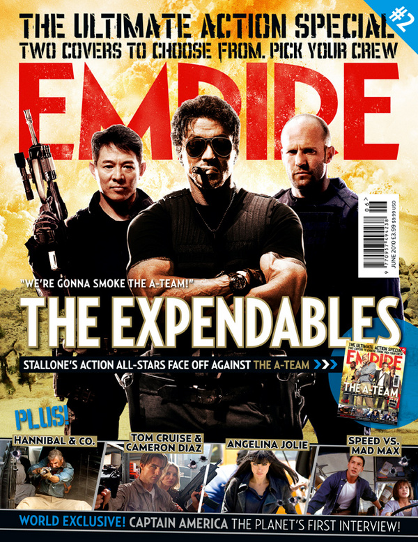
The denotation of this magazine is a medium long shot of three characters’ in the movie “The Expendables” this image is the main picture graphic on the front of the magazine.
The main image shows a trio, with the focal point being Sylvester Stallone, showing him looking straight forward in an medium close up shot, with his eyes covered, this could connote his eyes have seen evil, as the saying goes, “you can see what others fear in their eyes”, therefore this focal point could show that he is firstly the main part of this film and also he has seen many horrific scenes, therefore making him stand out from the others in the image because their eyes are not covered.
The composition of the main image is in a trio, showing the main person closer and the two other men behind him, this could connote them being firstly back up for him in the film, also the trio type of image could connote a team dynamic, showing a symmetrical type image, however the chaos in the background proves that the film has several scenes of action involved.
The bright lighting shows denotes that the characters’ in this image are not dark characters, this is because the main background is a bright colour, and the use of high key lighting suggests that these people in the image are angel like characters’ in the sense that they fight for the good of mankind.
The masthead is displayed behind the focal point of the magazine cover, in this case which is the image, This masthead is unique in the fact that it joins the whole colour scheme, as a more pale red colour with small yellow splashes on the image, this could therefore connect the word “Empire” with the fire background. Also the colour of the masthead is red, this could connote that the film is horrific and has a lot of blood in it. Even though most of the masthead is covered by the main image, it is obvious for the audience that the magazine is “Empire”. As well as the signature font being used on the masthead, this is similar to MS Reference sans serif font.
The main cover line says “We’re gonna smoke the A-Team!” this is controversial because both film are due to release at the same time, therefore this cover line says that this film is better than the well know A Team movie. This therefore makes the audience consider this movie over “A team” creating a buzz about the movie and making more people want to see the movie.
The bottom of the magazine is promoting other movies, however what I find interesting is that all the films are of the same genre therefore making sure the audience of this magazine are interesting in the full cover and furthermore finding this magazine aesthetically pleasing.
The fact that other films are mentioned on this magazine cover shows that high profile films are only mentioned in this magazine, also the fact that “The Expendables” is the main film in this issue of the magazine, creates a buzz about the film firstly, and secondly it makes people want to find out more about the movie, for example the reason it may be the main image and not just mentioned a diminutive bit like the other films .
No comments:
Post a Comment