Name of film: Lullaby
When we will be filming: 21st September 2010
Where: In the media corridor
The teaser trailer is set over a one day.
The scene is set in a corridor, in which we will be using as a room for our main character. Horror films are usually set in dark and cold periods, so I would say at 11pm at night and in December. By her costume, you can tell that there is a sense of 'old-fashion' in the teaser trailer.
The costume is an essiental part of the teaser trailer because it is substatually bigger than the main character, connoting a lot, like whether it is hers or not.
Shot 1: Girl in closet, rocking back and forth, humming to herself.
Transition: Shot cuts to black here
Shot 2: She slowly stands up and turns around to face camera
Transition: Shot cuts to black here
Shot 3: Girl stands up and walks towards camera
Transition: Quick-paced cuts between shots then normal pace resumes
Shot 4: Girl's hand dripping with blood
Shot 5: Close-up of girls face.
Shot 6: Another shot of girl's hand dripping withi blood, but this time from a low angle looking up at her hand.
Shot 7: Extreme close-up of girl raising her head. Camera turns from out of focus to in focus.
Shot 8: Girl standing and turning her head from left to right, to face the direction of the camera.
Fenetta

Storyboard


This storyboard shows the first ideas, using this when filming it was easy to see which shot we all needed and using the storyboard it was easy to come to terms with the order for the editing of the video to make the final product.
using a simplistic but effective first idea, the group decided to produce 4-6 differnt shots, place in a teaser trailer, influenced by the normal conventions of horror teaser trailers.
making a unique horror teaser trailer is in our groups interest and by producing experimental shots and methods the group are aiming to produce an exciting final product.
After using this storyboard when shooting the group decided to use the story board as a main outline, once reaching the editing phase of the process, the group looked at the sequence of shots taken, and decided that the process needed to be repeated and more experimental shots needed to be added to the end product to add individuality and an interesting teaser trailer.
The group therefore decided to produce a new storyboard, using a more interesting sequence, this is because the first idea was to simplistic and the shots placed in this order produced a slow, random teaser which made no sence at all. This was because the random shots placed together didn't make any sense, the group therefore decided this must be changed because then the end product will be better.
Lauren Lawlor
How often do you watch horror films?

2 people watch them all the time, so this would be ou target audience.
How old are you?

What do you think makes a good horror teaser trailer?

Are you male or female?

Do film teaser trailers influence your decision on whether or not you want to watch a film?

What sub-genre of horror do you prefer?

Although we have done this and the top responses were Physcholical thrillers and Serial Killers, we decided to gi with J-Horror as we wanted to do something different from what everyone else in our year was doing.
We went against our feedback, something that could jeopardise our whole production stage.
We went against our feedback, something that could jeopardise our whole production stage.
If yes, what makes you want to watch the movie?

Suspense, seemed to be a reoccurring theme in this question, so in our tariler, we tried to use a lot of suspense to lure in our audience.
What's your opinion on the horror genre?

How many times do you watch your sub-genre?

Fenetta's textual analysis: EMPIRE MAGAZINE. 'Inception'.

Empire magazine is a well known movie review magazine that usually features big hit movies as its front cover feature. This edition of Empire features a Christopher Nolan movie called Inception.
Firstly, when you look at this poster, you see a dark background that fades into a lighter image. This could be to connote the film starting in a dark place and then ending in a light place, or could have simply been done so that the font of the poster could stand out more and be seen. In the background, from far, looks like a maze of some sort with a lot of rectangles and squares in the view, but if and when you look closer, you can see that it is actually a bird’s eye view of buildings and architecture, which is a key theme of the movie.
Another key theme of the movie is being able to invade someone’s dream in order to change what they do, which is a very surreal theme that can be linked to the surreal-ness of the magazine front cover. The fact that the text on the front cover looks like its being pushed back by the protagonist’s figure makes the reader know that the man in the centre of the picture is of high importance. Also, the man’s stance, tells us that he means business and is very serious. He is wearing a black suit with a white shirt that is buttoned right to the top with a black tie, looking very official telling us that he is an official figure in the movie. His NVC connotes that he is serious and the stern look on his face makes us feel a little bit uncomfortable because of the serious glare that is on his face. Also, the fact that he is positioned in the centre of the magazine front cover and the fact that the text is almost wrapped around him gives us the idea that the world revolves around him in this movie, which could also mean that he is an essential character in this movie.
The colour scheme of blue/grey, black, white and red also connotes seriousness within the movie. The colour red automatically makes me think of blood and because the character has a gun in his hand, this could mean that there is blood in the movie. Red also makes me think of seriousness and sternness so by the fact that the name of the film is written in red, shows us that it is a serious movie.
If you haven’t watched the movie, you wouldn’t know this but Empire gives us a slight hint into what the movie is about with its little gold badge on our pain characters body where is says “Dream access to the movie event of 2010”. The movie inception is about dreams so Empire used irony and a play on words on the cover to make it seem funny. Another point is that the man is standing in front of the EMPIRE title and his head covers some of the letters, also continuing on from the point that he is dominant and that he has a lot of control and authority that even the magazine title is behind him.
Also, the fact that has a bird’s eye view of the buildings also shows dominance and his importance. He has the power to do whatever he wants in an alternative world of dreams.
Treatment
We are requesting the permission to make a horror film teaser trailer for my media A2 coursework. To make teaser trailer, I will need to use a digital camera which I will borrow from the media department and will use to film our horror tearser trailer. After filming, I will edit it in Final Cut Pro and select the parts that we need in order to formal our final cut of our teaser trailer. The target audience for my horror teaser trailer will be for males and femals mainly between the age of 16-28 and I will get critical feedback from thr public viewers on Youtube.
Our genre of film is horror, and we will be developing a 30-45 second teaser trailer suitable for TV viewing and cinema advertising purposes promoting our film. Along with a teaser trailer, we will also be making another 2 forms of promotional media such as a magazine front cover and a poster. This blog will be used to keep our teachers and you, the examiner, up to date and informed on our progress as a group and as individuials.
Our genre of film is horror, and we will be developing a 30-45 second teaser trailer suitable for TV viewing and cinema advertising purposes promoting our film. Along with a teaser trailer, we will also be making another 2 forms of promotional media such as a magazine front cover and a poster. This blog will be used to keep our teachers and you, the examiner, up to date and informed on our progress as a group and as individuials.
Textual Analysis of a Magazine - Lucy Luu
 ‘Empire’ is a British film magazine published monthly by Bauer Consumer Media. It is the biggest selling film magazine in Britain, consistently outselling it’s nearest market rival ‘Total Film’ and is also published in Australia, Turkey and Russia. I decided to analyse ‘Empire’ magazine due to its popularity in many countries, active readers and its ways of strongly promoting a vast variety of different movies.
The movie featured for this 'Empire' magazine is 'Watchmen'. The magazine consists of a colour photograph of three men, two looking directly into the camera and one looking down. It is a medium long shot as their arms and legs are shown and they are all standing in a way which makes them look frightening and masculine. The background of the photograph is a dark purple and the photograph covers the whole of the magazine.
When we first look at this magazine, the first thing we would see is the man photographed in the middle and then our eyes would shift to each man standing on each side of him. The way the three men are dressed makes me think of them as villains rather than superheroes due to the fact that they are all dressed differently and without the iconic robes seen on ‘Superman’ or ‘Batman’. The reason as to why I think they are villains rather than superheroes is because of their costumes. The man in the middle is dressed in all black such as black spandex leg wear, a black padded body jacket which looks like it is bulletproof, black gloves, a black mask covering only his eyes with a cigar in his mouth. Wearing all this black could suggest that he doesn’t want to be seen while committing crimes and wearing black could disguise him in the darkness as criminals usually commit their crimes during the evening when it’s dark. Although I cannot see much of what the man to the left is wearing, I also think he too is a villain due to his mask only covering his eyes which could mean that he is also trying to conceal his identity while committing crimes. He could also look as though he is the right hand man of the man in the middle (similar to Batman and Robin). Both men are seen to be dressed rather similarly but the man on the right is dressed the most strange. He is wearing a long brown leather trench jacket, a grey top hat and his face is unknown which makes him look very sinister. With his eyebrows masked, the facial expression of the man in the middle shows he is very serious and not to be messed with, and he is looking directly into the camera as if they are his enemies. His ‘right hand man’ has his chin slightly up and looks down into the camera making it look like he is trying to make the audience feel insecure while gazing at them. The facial expression of the last man is unknown as we cannot see his face; instead of his face we are only visible to the mask with patterns which resemble a structure of a face.
The lighting in the photo is used in an extent to see all the facial expressions and details on the actor’s faces, making sure everything is visible including make up, costume and other props such as the masks and guns. I would say the lighting on this magazine front cover is rather high key as everything is visible but the main use of high key lighting is primarily used on the top half of the actors to make sure they are visible enough for the audience to see. The colour used in the background of the magazine cover is a dark purple, the reason it behind a dark purple rather than a light purple could signify that the characters themselves are dark which could also move onto them being evil characters. Also in the background behind the actor’s heads there is a mist of smoke, the smoke could be there to connote that a gun shot has just been fired seeing as the gun held by the character in the middle is pointing upwards, the smoke could be represent them as criminals therefore wanting to cover up their identities.
The main colour used in this magazine is yellow; other colours used are red, blue, white and grey. The colours used in the magazine were chosen very carefully as they compliment and contrast each other and by using the bright yellow font, it makes it stand out to the audience thus highlighting them and appearing more visible. I would say that the signature red ‘Empire’ masthead and the yellow ‘Watchmen’ used in the main story title and other slogans stands out well against the dark purple used for the background as they contrast each other and the word ‘Watchmen’ is definitely the first word we see because of it being in the middle and in a bright yellow font.
Empire is a popular magazine, therefore they have their signature red masthead which uses a font similar to MS Reference Sans Serif, keeping it legible and simple. Parts of the masthead letters are concealed due to the actor’s head being in front of them; this is a common conventional technique used in many magazines (usually a popular magazine as the audience will still know the title without being able to see parts of the letters). In a bright yellow font makes ‘Watchmen’ stand out much more than the rest of the text as it is big and bright yellow’ highlighting the fact that it’s important. I also like how on the ‘M’ of ‘Watchmen’ is a red blood splat which could show that this movie involves killing therefore resulting to blood splatters. The red blood splat works well on the yellow ‘M’ as is stands out clearly for the audience to notice. Underneath ‘Watchmen’ there is a caption (also in yellow to show they belong with each other) telling us about what the story will be featured on. Another yellow slogan clearly visible is the one above the ‘Empire’ masthead, I can definitely say the yellow used in this magazine cover is very effective as they stand out the most and they are the first headlines the audience will read. Although the main colour on this magazine is yellow, there are other significant colours used such as the blue and grey. The blue used in this magazine cover is not used to an extent that we see it everywhere; it is cleverly used in the small details such as the little heading stating that this magazine cover is 1 of 2 Watchmen covers. It is also used for the cross on the near bottom left hand side which stands for ‘plus’ indicating other features in the magazine. The minimal usage of white and grey are used in the bottom headers to create a more neutral feel as the other colours used are rather vibrant, the grey and white text seem to hide behind the yellow text more as yellow almost ‘pops’ out to the audience. Beside the barcode is what looks like a sticker highlighting another feature about ’10 Years of DVD! How a decade of discs changed cinema forever’, this is another way of placing words onto the front of the magazine to make it look more interesting and to stand out just as much as everything else. It is in grey which compliments the grey text beside it and once again the yellow text glows right through the grey, again making it stand out.
Textual Analysis on teaser trailer
The haunting in Connecticut is based on a true story,
This textual analysis will be focussing on the teaser trailer for Haunting in Connecticut, The teaser is 61 seconds in length, it still teases the audience about the film and creates a large buzz about the movie.
The opening of the trailer is a shot peice of dialogue saying "wheres the catch" followed by the man saying "well, it does have a bit of history" making the views think what that history actually is, Also to create a change in mood, the begining of the trailer shows a more high key lit area, this connotes a more happier, safer enviroment, however once the trailer gets tense, the lighting becomes low key and this makes the viewers feel on edge and also waiting for something bad to happen.
The flashbacks into the past are shown in black and white and also a sepia tone to help the audience distinguish from what is the past, and what is the present in the trailer, this can be shown by this because colour is more up to date, and there is not many black and white movies recently made therefore it's a natual instinct to see the differnce between the two time frames.
The teaser opens with a close up of a newspaper showing a large caption of “séance of death, Five dead; one missing” this shows a quick shot that gives you an insight into the movie, the non-diegetic music is loud and screechy creating a on edge feel. Giving the audience a feeling of danger and nowhere is safe.
A fast zoom into the newspaper followed by a medium close up shot of the main character (the boy) , looking agitated and under pressure. The low key lighting creates a feeling of danger and that the surondings are not safe. This teaser follows normal conventions as the low-key lighting, scretchy backing track and fast cuts to many different shots.
A transition of many shots of the film are placed together, to create a sense of chaos and not being in control, The shots teased the audience by showing a empty room with an operating table, cutting to operating tools. This gives the audience some idea what the film is about, without showing the whole storyline to them fully.
The use of fast cuts showing 7 different shots, shows the audience that this film is jumpy and creates a feeling of danger and when your trying to see what the shot is of, it cuts to a totally different one, therefore producing a freaky uneasy horror film.
A common theme takes place throughout the whole teaser trailer, firstly the camera shots are very interesting and produces a horror feeling, by firstly the camera shots fit the conventions of the genre, and therefore the teaser is conventional, and therefore the directors are producing a spine tingling horror.
In the transition of fast cut sequence, there are loud scream sounding like there coming from the distance, creating a sense of danger, this also follows normal conventions as the screams are related with horror and being in danger.
The idea of fearing what we can not have control of is applied in this teaser, when a character says “and it wants your son” followed by a cut to a longer shot of 3 seconds of the son in a room with a door slamming without anyone touching the door, this makes the audience feel uneasy and in danger.
The sense of invading the character’s space can be applied in this teaser showing many point of view shots, followed by shots making it look like they are being watched, this makes the audience think that no body is safe, and there being watched non stop.
The pace of this teaser, creates a tense feeling for the audience, in the beginning of the teaser the pace is slow, then followed by fast sequential shots, this contributes to the tensions feel and the feeling of being in danger.
The shots are followed by a long shot of the boy in bed, becoming distressed, then it cuts to his mother saying “Cal what have you done to yourself’ this makes the audience think that maybe it’s him doing everything, creating a sence of wonder in the audience, making them think about the actual storyline and what to expect.
A close up shot of the boys body shows many random words engraved into his skin, however you can not read any of the words as the transition quickly fades into a shot of an empty bed, with a bat quickly flying pasted the shot, making the audience think, the bats could connote vampires and blood, also they could connote the paranormal and danger.
The main character seems to not be in control as the events are becoming worse and worse, the caption “The fear is real” makes the audience feel uneasy, as no one likes the feeling of danger and being close to evil or the paranormal.
The man then says on a telephone in a distressed tone “you must get out now” this is follow by quicker shots then followed by a worsened problems, more close to death situations, showing more people involved.
Magazine front cover anaylsis - Lauren Lawlor
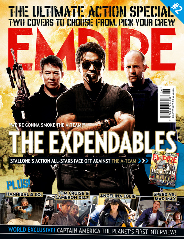
The empire is the biggest selling film magazine in Britain; it is also published in Australia, Turkey and Russia. Empire organises the annual empire awards, which were sponsored by Sony Ericsson until 2009 and are now sponsored by Jameson. I chose the Empires front cover to review because it has active readers and strongly promotes certain films, as well as having features in the magazine film audiences would like to read about.
The denotation of this magazine is a medium long shot of three characters’ in the movie “The Expendables” this image is the main picture graphic on the front of the magazine.
The main image shows a trio, with the focal point being Sylvester Stallone, showing him looking straight forward in an medium close up shot, with his eyes covered, this could connote his eyes have seen evil, as the saying goes, “you can see what others fear in their eyes”, therefore this focal point could show that he is firstly the main part of this film and also he has seen many horrific scenes, therefore making him stand out from the others in the image because their eyes are not covered.
The composition of the main image is in a trio, showing the main person closer and the two other men behind him, this could connote them being firstly back up for him in the film, also the trio type of image could connote a team dynamic, showing a symmetrical type image, however the chaos in the background proves that the film has several scenes of action involved.
The bright lighting shows denotes that the characters’ in this image are not dark characters, this is because the main background is a bright colour, and the use of high key lighting suggests that these people in the image are angel like characters’ in the sense that they fight for the good of mankind.
The masthead is displayed behind the focal point of the magazine cover, in this case which is the image, This masthead is unique in the fact that it joins the whole colour scheme, as a more pale red colour with small yellow splashes on the image, this could therefore connect the word “Empire” with the fire background. Also the colour of the masthead is red, this could connote that the film is horrific and has a lot of blood in it. Even though most of the masthead is covered by the main image, it is obvious for the audience that the magazine is “Empire”. As well as the signature font being used on the masthead, this is similar to MS Reference sans serif font.
The main cover line says “We’re gonna smoke the A-Team!” this is controversial because both film are due to release at the same time, therefore this cover line says that this film is better than the well know A Team movie. This therefore makes the audience consider this movie over “A team” creating a buzz about the movie and making more people want to see the movie.
The bottom of the magazine is promoting other movies, however what I find interesting is that all the films are of the same genre therefore making sure the audience of this magazine are interesting in the full cover and furthermore finding this magazine aesthetically pleasing.
The fact that other films are mentioned on this magazine cover shows that high profile films are only mentioned in this magazine, also the fact that “The Expendables” is the main film in this issue of the magazine, creates a buzz about the film firstly, and secondly it makes people want to find out more about the movie, for example the reason it may be the main image and not just mentioned a diminutive bit like the other films .
The Haunting In Conneticut -Lauren Lawlor

The use of a long shot in this image could connote a feeling of danger, in other words the people in the image are show to be performing a form of exorcism, and image could connote that the people’s feelings are as there not safe and the room seems bigger than it actually is, therefore they feel unsafe.
The focal point of this image is a boy on the roof of the room, firstly the boy is at a stance which denotes a crucifix shape, this could connote this film has a religious story line or set in a religious area, however the boy is looking over the table of people undertaking the exorcism and the area around him is extremely bright contrasting with the rest of the image, therefore in my opinion it connotes that the boy is being watched by God especially and is going to prove to people that God is able to make good of any evil situations.
The use of a long shot also could show the peoples inner thoughts, for example they feel so unsafe that they feel minuscule and helpless. The use of a flame in the middle of the table could connote danger and an evil force lurking in the remains of the house.
To anchor the audience the maker of this movie poster has been intelligent by putting little information of the movie on the poster, and just writing “Based on true events” above the focal point on the image, therefore a buzz will be created about the movie with the audience judgments of what would actually happen in the movie, therefore people will want to see the film.
The lighting in this poster is rather dark, which can connote an evil force occurring in the area, using a sepia tint on the poster it shows that this is an old fashioned movie in term that the movies events may have occurred from past events.
The poster shows no actor’s names or directors’ names, this therefore breaks normal conventions and makes the film seem more real in the state that it’s based on true events, this poster also is more of a teaser for what the film has to come and does well to create a buzz about the film intentionally.
The use of the tagline “what if the only explanation for what you saw was unbelievable?” shown in a tiny font so when people see this poster they have to take a closer look at the poster, therefore more people will look at the poster properly because its breaking normal conventions of having a large tagline, therefore making this poster stand out from other posters.
This poster is intelligent in the fact that there is no emotion show on the people’s faces in the image, showing the individuals with a dark shadow surrounding them, connoting a evil presence, also you can see the people bowing their heads, which could also add to the whole idea of a religious plot in the movie because the focal point also connotes a religious view.
Textual Analysis of a Film Trailer - Lucy Luu
Textual Analysis of 'The Strangers' Film Trailer
From the very instance we are drawn into the movie trailer of ‘The Strangers’, we immediately sense a feeling of fear with the constant use of low-key lighting and with that we know it’s a horror movie trailer. Continuing with the constant use of low-key lighting, we signify this with a horror movie as a majority of horror movies contain low-key lighting to maintain the suspense.
The opening of the movie shows an old rusty, dirty, alienated one story home. Champagne, rose petals, candlelight, and engagement ring. This night was supposed to be a night of celebration for Kristen McKay (Liv Tyler) and James Hoyt (Scott Speedman), but not soon after returning to the family vacation home, everything had collapsed for the happy couple. The movie starts off as joyous and happy with the two main characters living a normal, non-disturbed lifestyle but is soon intruded by three strangers at 4 am.
The movie has begun happily with the two main characters living a normal, non disturbed lifestyle. After the man brings out the box which we instantaneously indicate as being a sign of marriage proposal, the couple are accompanied with three mysterious and anonymous strangers. The way the scenes of the horror movie trailer are placed out shows parts of what happens scene after scene without giving away too much, by doing this the audience instantly speculate what occurs between the cuts which creates mystery and leaves the viewer with a desire to see the rest of the movie.
Just from the first few minutes of the movie we know the movie will be based around the old rusty alienated house shown, we also suspect it’s going to be another one of those horror movies where they’re in the middle of no-where judging from the spacious grounds around them. The style of the house also lets us know where they could be located as the house is mainly made of wood and within the home there are several animal stuffing’s hung on the wall which could be a sign of them living in the woods.
Although there are actually five characters in this movie, there is only two that are revealed to us as the other three are masked. The first scene we see is off the man setting up a romantic atmosphere for his girlfriend, this denotes that he is a romantic man. The woman is shown to be a girly girl as she wears a dress and likes to have baths, later on she changes into more comfortable, less feminine clothing, this shows that she is laidback. The reason to have the man create a romantic atmosphere for the woman shows that he wants to commit to her (shown by the engagement ring) and that he is there to protect her when she is in danger as he says to her ‘you are my girl’, he is also shown as brave and is the one who goes out to check what’s going on while the lady waits behind. The lady is represented to be quite useless and hides behind the man to protect her, this is the stereotype of most women in horror movies as they are usually portrayed as hopeless so the male can ‘save the day’.
There is no voice over, using no voice over makes the trailer seem more real as if there were to be a voice over, it would seem like the story has already happened and is being retold by someone else. Instead of having a voice over, this trailer includes onscreen captions. The on-screen captions consist of ‘Inspired by true events’: this definitely makes the movie seem more like reality and by putting ‘inspired by true events’, it makes the audience afraid that the same thing may/could happen to them. ‘We always tell ourselves there’s nothing to fear… but sometimes we’re wrong’ makes the audience think that something is about to happen and it will be something to be afraid of, it also makes the audience wonder what’s going to happen to the characters of this movie.
The pacing of this film trailer changes throughout the scenes of what happens after one another, first the trailer starts off as slow with the romantic scenes and the slow piano music, the music then starts to speed up after the two main characters have discovered that someone is intruding in their privacy. The increasing speed of the pace of images and sound could indicate that they need to run for their lives as danger is approaching.
The trailer includes a lot of fast cuts after the intruders are introduced to the scene. The fast cuts speed up the trailer as it makes it more terrifying and makes it seem as the characters are running for their lives. The sound inserted into the trailer starts off with slow and calm piano keys, it then slightly starts to get faster, we then hear a diegetic sound of a broken record which could signify that the things happening to them could have happened to other people and is therefore repeated, underneath the sound of the broken record we are introduced to a very high pitched non-diegetic noise which indicates something sinister is about to happen.
Most of the camera works in the trailer are long shots; long shots are used in the trailer to show the empty surroundings and the decorations of the location inside the house. A lot of medium close ups are also used to show the reaction and expressions of the character, the only time we see close ups are when the couple are embracing which shows how close they are and how much they really love each other.
The trailer started by giving the viewer a neutral feeling, this is used so the viewer can be drawn into watching to movie until the end. The end of the movie we know that something is going to happen and it may not end well. It was well edited as the pace of the trailer made it more and more intense as the viewer watched on, this makes it into a horror movie trailer.
The film studio distributing this movie is Rogue Pictures (co-production with Intrepid Pictures). As well as having released movies with a comedy genre, Rogue Pictures is also known to release horror movies, ‘White Noise – The Light’ was released before ‘The Strangers’, and after the strangers came many other known horror movies including ‘The Unborn’, ‘The Last House On The Left’, and ‘My Soul To Take’. With the amount of horror movies being distributed by Rogue Pictures, it shows they have an interest in making horror movies which is why it is a good film studio to distribute ‘The Strangers’.
This film trailer is played before the actual movie so that it can give the viewers an insight on what the film is going to be about and to interest them in watching it as they will already know a little of what it’s about. The trailer doesn’t necessarily tell you what the entire movie is about but it gives you an insight with a little information so you’ll develop an interest to go watch it. Just by showing you little parts of the movie, it tempts you to want to watch the rest of the movie.
Analysis of existing poster: ‘A Nightmare on Elm Street’

The 2010 release of ‘A Nightmare on Elm Street’ launched horror movies back into fashion. With the largely anticipated return of Freddy Kruger, this film had quite a buzz raised around it.
Freddy Kruger, the main object in this poster, is a fictional character that stalks people’s dreams and can make a nightmare, a reality. He uses a glove armed with sharp razor blades to kill his victims.
The setting of this poster appears that a man; Freddy Kruger is in a room, a very dimly lit room with only a single light behind his head. He is wearing a large hat, almost like a top hat and is dressed in the recognisable red and green striped jumper. One thing that is striking about this poster, is that, the poster doesn’t say his name, but to the horror niche, his stance is very recognisable. From the way he stands to the light bouncing off his roughly textured skin, people familiar with the old ‘A Nightmare on Elm Street’ movies, with quickly be able to recognise who he is.
The medium close-up shot of Freddy is enough to show us what he is wearing and his costume is a crucial part of this film as this is all you ever see him wear throughout the movie.
The poster in general is a very dark and chilling one. From the room in which Freddy is standing in, to the smirk on his roughly-textured face. The appearance of Freddy and the darkness and coldness you almost feel as you look at this poster, depicts a harsh and scary atmosphere. One that almost makes you feel uncomfortable.
Freddy’s eyes are not visible in the poster as his brown/tanned fedora is covering his eyes. Although the eyes are one of the features that let you determine ones emotions, you can straight away tell by the smirk on Freddy’s face, that his eyes would be narrowed in an evil glare.
Freddy’s hands are folded over and you can see the highly recognisable gloves with the blades on the end. One finger in particular is sticking out of the clasp and this shows his weapon of choice; his blade. There is a reflection of light coming off his finger, this was most probably done to show the sharpness of his blade and also, to make you aware that it is there.
Freddy’s jumper is an iconic piece of costume and is probably one of the most recognised costumes in the history of horror films. In the old version of ‘A Nightmare on Elm Street’, Freddy wore the same red and dark green jumper. In this re-release of the old horror film, the jumper is the same but looks more worn out and has strings pulled. You can also see this in the poser, if you look closely at the sleeve area of Freddy’s jumper.
The red font connotes blood and gore which is very familiar to films in which have Freddy Kruger in them. The font type looks almost skeletal and has a chilling sense to it. The word “NIGHTMARE” is written bigger than the rest of the words probably because it is the main feature of the film and the theme of the film is being trapped in a nightmare. The little caption for the movie reads “WELCOME TO YOUR NEW NIGHTMARE”. By this being written in white, could be so that it is visible as the poster is very dark. It also makes it stand out, but not more than the title of the movie.
I thought the use of the word “New” makes things more interesting, since the old version of this film was released in 1984, meaning mostly people born in the early 70’s would have watched this film. Due to the re-release, it opens up another audience criterion for people born later than the 1990’s.
This movie appeals more to teenagers than to adults since the main characters are teenagers and I feel that the re-release will fetch a more broad audience since technology has changed.
Film Poster Textual Analysis - Lucy Luu
Textual Analysis of The Strangers
The first thing we look at when we are looking at this film poster is the still woman, we immediately notice her as she is beyond the darkness and stands out to us as she’s wearing a red and white chequered top which stands out due to the vast amount of brown and black used. The NVC on the woman’s face looks as though she is frightened but also does not know what event will happen next. After noticing the woman, we instantaneously turn our attention to the head of a man creeping from the dark, we notice this as the mask is a dirty white and it’s appearing from a largely dark atmosphere. Although the man doesn’t have an expression on his face (as he is wearing a bag with holes over his face) we instantly assume he is the one who will be terrorizing the woman as he is isolated from her but his body position is faced towards her as though he is about to lash out and attack her from within the darkness hence the caption reading ‘We tell ourselves there’s nothing to fear, but sometimes we’re wrong’.
A vast majority of the brown is from the furniture in the house, this could indicate that the house is located in a private location and away from society and has a more ancient than modern atmosphere due to the wooden table, wooden shelves, wooden flooring. A clue to suggest that the house is located in the woods would be the stuffed animal head of a deer hanging on the wall hinting that the animals used to decorate the home have been hunted and stuffed themselves. The house being so tidy and in place could mean that people don’t live there very often which links to the caption on the other film poster ‘Because you were home’.
The messages in this poster are primarily visual as there aren’t many verbal clues as to what will take place in this movie apart from the one caption ‘We tell ourselves there’s nothing to fear, but sometimes we’re wrong’. This caption tells us that something horrific may happen and we as the audience or the characters themselves are wrong to tell ourselves there’s nothing to fear.
The intended audience of this movie would probably be in the age range of 16 – 30, mainly males. Males at the age of 16-30 would most likely watch this movie because during this age, their most watched genre of movies would most likely be horror and they may prefer the suspense and tense feeling horror movies give them than generally most females would. Females are less likely to watch this movie as females tend to be more squeamish and their least favourite movie stereotypically is horror movies, but this doesn’t stereotype for all females, some females also love the tense and suspense given off by the horror movies.
The cast for this movie only consists of five members, three of which have masks on throughout the entire movie, therefore the actor and actresses are hidden to the audience, this makes the audience wonder who the three killers may be and keeps the audience in suspense. The two main characters whose names are on the film poster shows that they are following conventions by putting the names of the main actor and actress on it. The main actor and actress who are being terrorized are known to the public but they are not Hollywood’s biggest actors/actresses can make the movie seem more like reality as the audience are not too familiar with the actor/actress being in every other movie.

Just from looking at this film poster you may feel that something bad is about to happen from the dark atmosphere and the scary looking man with a mask covering his face hiding in the dark. There aren’t many colours in this film trailer, but the colours that do appear are shadowy and sinister, we have a black shadow on the top and bottom of the film poster, this could connote that something bad is about to occur in the household and especially to the woman who is standing still and very unaware of her surroundings. Apart from black, the film poster also includes a great deal of brown from all different shades. The brown is generally used on the house’s furniture and surroundings.
The first thing we look at when we are looking at this film poster is the still woman, we immediately notice her as she is beyond the darkness and stands out to us as she’s wearing a red and white chequered top which stands out due to the vast amount of brown and black used. The NVC on the woman’s face looks as though she is frightened but also does not know what event will happen next. After noticing the woman, we instantaneously turn our attention to the head of a man creeping from the dark, we notice this as the mask is a dirty white and it’s appearing from a largely dark atmosphere. Although the man doesn’t have an expression on his face (as he is wearing a bag with holes over his face) we instantly assume he is the one who will be terrorizing the woman as he is isolated from her but his body position is faced towards her as though he is about to lash out and attack her from within the darkness hence the caption reading ‘We tell ourselves there’s nothing to fear, but sometimes we’re wrong’.
A vast majority of the brown is from the furniture in the house, this could indicate that the house is located in a private location and away from society and has a more ancient than modern atmosphere due to the wooden table, wooden shelves, wooden flooring. A clue to suggest that the house is located in the woods would be the stuffed animal head of a deer hanging on the wall hinting that the animals used to decorate the home have been hunted and stuffed themselves. The house being so tidy and in place could mean that people don’t live there very often which links to the caption on the other film poster ‘Because you were home’.
The messages in this poster are primarily visual as there aren’t many verbal clues as to what will take place in this movie apart from the one caption ‘We tell ourselves there’s nothing to fear, but sometimes we’re wrong’. This caption tells us that something horrific may happen and we as the audience or the characters themselves are wrong to tell ourselves there’s nothing to fear.
The intended audience of this movie would probably be in the age range of 16 – 30, mainly males. Males at the age of 16-30 would most likely watch this movie because during this age, their most watched genre of movies would most likely be horror and they may prefer the suspense and tense feeling horror movies give them than generally most females would. Females are less likely to watch this movie as females tend to be more squeamish and their least favourite movie stereotypically is horror movies, but this doesn’t stereotype for all females, some females also love the tense and suspense given off by the horror movies.
The cast for this movie only consists of five members, three of which have masks on throughout the entire movie, therefore the actor and actresses are hidden to the audience, this makes the audience wonder who the three killers may be and keeps the audience in suspense. The two main characters whose names are on the film poster shows that they are following conventions by putting the names of the main actor and actress on it. The main actor and actress who are being terrorized are known to the public but they are not Hollywood’s biggest actors/actresses can make the movie seem more like reality as the audience are not too familiar with the actor/actress being in every other movie.
Texual Analysis Movie Poster - Buried 2010 - Benjamin aColatse
 The Film Title: Buried
Year Of Release: 2010
Director: Rodrigo Cortés
Producer: Adrián Guerra Peter Safran
Production/Financing company: Versus Entertainment Safran Company The Dark Trick Films Studio 37
Actors:
Ryan Reynolds as Paul Conroy
Ivana Miño as Pamela
Anne Lockhart as 911 Operator/CRT Operator
Robert Paterson as Dan Brenner
José Luis García Pérez as Jabir
Stephen Tobolowsky as Alan Davenport
Samantha Mathis as Linda Conroy
Warner Loughlin as Donna Mitchell/Maryanne Conroy/Rebecca Browning
Erik Palladino as Special agent Harris
Heath Centazzo as Soldier
Joe Guarneri as Soldier
Film Origin: Chris Sparling
Synopsis: Paul Conroy wakes up 6 feet underground with no idea of why he is there, and is pretty sure that he is not ready to Die. So life for the truck driver and family man suddenly becomes a hellish struggle for survival. While Buried with only a cell phone and a lighter, therefore limited contact with the outside world. Along with Poor reception, a rapidly draining battery, and a ever lowering oxygen supply in a tightly confined race against time - Paul has only 90 minutes to be rescued.
Analysis:
Film Posters are a type of Advertisement prominently displayed on Billboards, film theaters, in magazines, the Internet, and most commonly the side of Buses. The objective of a poster fundamentally is to sell the film to make an audience want to see it. In addition to this, certain devises are used.
The consistency of the colour used in this poster are Low Key such as Black and dark brown colours, along with some Red and some White Text. Which principally connotes a Horror themed movie. The crucial colours are Black and Brown which connotes the characteristics of being ‘buried’ or underground, confind space creating emphasis on the claustrophobic feel, all in which links to the plot of the film. In contrast, a brown and amberish colour and a little bit of what seems to be wood is used to emphasise the character in the poster. This colour can symbolize the Heat, minimal light coming from the lighter for example the darkness of being trapped. The brown & texture used can emphasise the dirt, soil and ‘down under’ feel. And Red, the conventional colour that represents blood, anguish and death in connection with Horror Films.
The main Prop used in this poster is the Lighter which is collectively used as the ‘I’ in ‘Buried’
Texual Analysis Magazine Front Cover - Empire Harry Potter 7 - Benjamin aColatse

Analysis:
“Empire magazine is a British magazine published monthly by Bauer Consumer Media.”
And is also one of the biggest selling film magazine company in Britain, without fail outselling its nearest market rival Total Film which is also published in many countries such as Turkey, Russia, Serbia, Croatia, Indonesia, and others. Empire is also responsible for organizing the Empire awards, which was previously sponsored by Sony Ericsson until 2009 and is now sponsored by Jameson. Readers of the magazine vote for the awards. I chose Empire magazines front cover to review because they are the leading Film magazine in Britain which means they have strong conventions when making they’re magazines therefore I think it would be advantageous to analyze and consequently identify how and why the magazines a effectively put together. In addition understand the communication between the audience and the magazine.
The denotation of this magazine is a colour half-length picture of Daniel ‘Jacob’ Radcliffe character ‘Harry Potter’ from the book & film series Harry Potter written J.K Rowling. This picture Harry Potter is the main picture graphic on magazine cover as he is the main character of the newest film of series, which is expected to be the summer blockbuster of this year due to the success of the pervious films from the series. Harry Potter looks to be half way in mid air with his wand pointed towards the camera lens connoting that he is in battle in a Medium Long Shot (MLS). He is surrounded by broken glass also connoting the battle theory with three broken slabs of glass containing reflection type images all in Close Up shots, two consisting of his only best friends from the movie Emma Watson character ‘Hermione Granger’ and Rupert Grint character ‘Ron Weasley’ both looking directly into the camera lens. This arrangement along with the Bold Yellow text saying ‘Friendships shatter’ and broken glass connotes that the friends are falling apart. The other slab of broken glass contains a reflection image of Ralph Fiennes character ‘Lord Voldemort’ who however is not looking in the camera lens, is looking up towards Harry Potter connoting that he is engaging in battle against Harry Potter. All character looks fierce and angry.
The lighting in all photos is used effectively to show the extent to all facial expressions and detail on their faces along with make up. Harry Potter has a few scuffs, cuts, and dirt on his face and is holding a wand almost over the camera. Along with actor Hermione Granger maybe connoting out of the three friends they will be involved in battle the most and maybe losing to the rivalry as Lord Voldemort does not look as if he has cuts/bruises on his face maybe connoting that he will not be losing or be directly involved in the battle going on in the movie perhaps he has built a army and they are fighting for him therefore he is a leader of battle. The sky in the background is Black and blue, dark and gloomy connoting and also associated with downtempo, sad and miserable feelings. Therefore the movie is not going to be blissful and in addition is going to be fiercer than the last films. Harry Potter is dressed in a suit maybe to connote to the audience that Harry Potter is now more mature.
The main colours are Red, Yellow, Blue, Grey with white text and a semi-signature red Empire masthead. The colour scheme is used professionally and successfully and is pleasing to the consumer’s eye. The grey bold writing adds to the gloomy feel while the Yellow writing ‘pops’ out to highlight the important headlines.
The font of the Masthead is similar to MS Reference Sans Serif font. The font is almost signature to the magazine as is a ordinary choice unless the font is thoughtfully changed to complement the feature on the font of the magazine. The Masthead is Red, which is a common masthead colour for the magazine, but also supports the Harry Potter theme of blood and anguish. The ‘I’ and the ‘R’ in ‘EMPIRE’ are not visible as Harry Potters head is over the letters which is a conventional technique of magazines in general, predominantly a popular one where the name of the magazine is noticeable to the reader even if parts of it are hidden. Above the masthead is ‘Our best preview issue ever!’ Displayed in bold Front similar to the ‘Empire’ font, with ‘Preview Issue’ in Yellow highlighting to the reader that it is a Preview Issue edition and statues they believe it’s the ‘best Preview edition ever!’. Then under ‘Empire’ in small writing is the sub name of the film but in small writing. The date the magazine was released has been placed in between the ‘M’ of ‘EMPIRE’ along the price in two different currencies. The magazine has been released a month before the planned release date strategically to develop momentum of the films release. ‘POTTER 7’ which is written in the middle of the magazines cover is ridicule as ‘Potter’ is what Lord Voldemort calls Harry Potter in the film. However sums up what the front cover is about as the audience that know about the film will recognize what the theme is about and is simply one of the selling lines along with ‘our best preview issue ever!’.
‘Evil unites’ and ‘the end begins’ both contrast one another as they connote two things you would not expect to happen, also can be seen as a Selling Line. The Barcode can seen as disruptive and covers parts of the glass putting it at a Landscape angle could have resolves. At the bottom is a Grey border advertising another section of the magazine this gives the magazine finished Magazine feel as an alternative of a Film Poster. ‘Plus’ is in an Yellow italic type writing with a grey rectangular behind same colour grey as the Border at the bottom of the magazine. ‘HEROES’ and ‘LEGENDS’ are both written in the same bold and coloured writing as ‘OUR BEST….EVER!’. Underneath these sub sections are a names written in the same writing as ‘Friendships shatter. Evil Unites.’. all representing the contrast and conventions of the Empire magazine.
Texual Analysis Teaser Trailer - Buried 2010 - Benjamin aColatse
The Film Title: Buried
Year Of Release: 2010
Director: Rodrigo Cortés
Producer: Adrián Guerra,
Peter Safran
Production/Financing company: Versus Entertainment,
Safran Company,
The Dark Trick Films,
Studio 37
Actors: Ryan Reynolds as Paul Conroy
Ivana Miño as Pamela
Anne Lockhart as 911 Operator/CRT Operator
Robert Paterson as Dan Brenner
José Luis García Pérez as Jabir
Stephen Tobolowsky as Alan Davenport
Samantha Mathis as Linda Conroy
Warner Loughlin as Donna Mitchell/Maryanne Conroy/Rebecca Browning
Erik Palladino as Special agent Harris
Heath Centazzo as Soldier
Joe Guarneri as Soldier
Film Origin: Chris Sparling
Synopsis: Paul Conroy wakes up 6 feet underground with no idea of why he is there, and is pretty sure that he is not ready to Die. So life for the truck driver and family man suddenly becomes a hellish struggle for survival. While Buried with only a cell phone and a lighter, therefore limited contact with the outside world. Along with Poor reception, a rapidly draining battery, and a ever lowering oxygen supply in a tightly confined race against time - Paul has only 90 minutes to be rescued.
Analysis:
The trailer has a consistent over all Low key/no lighting theme through out goes again the normal dynamics of a horror movie, denoting an over all Horror feel and connoting a mysterious and scary feel, this along with the minimal light used when the lighter is lighten also gives the setting connotes a mysterious look which is stereo typical of an Horror trailer, although the setting is only shown once through for around 2 seconds. And not much of his costume is shown all that is seen is that he is wearing some sort of dressing gown, which connotes that he may have been taken from his house at night/early morning time. There are 3 props used during the trailer: a lighter, Rope/cloth around the characters neck, and a wooden box. The rope/cloth around the actors neck connotes signs of the character has been kidnapped, and the wooden box that he is enclosed in along with the movie Title connotes that the character is Buried.
Also there is a fair use of Non-Diegetic sound such as sound effects however the majority of the sound is Diegetic e.g. ‘tone of phone keys calling 911’ “Pick up, pick up, pick up” which is used while the character rings emergency services “Yes 911” with his mobile phone connoting that he is struggling and the sound of the character moving. The Non-Diegetic sound effects donnote and back up the idea and convention of this being a Horror movie, as they sound & connote a gloominess, depressed, dejected standard. During the trailer there is also no Voice over/Score/incidental Music which challenges the normal conventions for a horror trailer.
There is also no Camera movement in this trailer, which connotes a feeling being stuck somewhere and also challenges the normal conventions of a Horror trailer. The camera angle consists of a simple eye level medium close up (MCU) shot of the character, which back ups the connotation of being stuck.
After analyzing the the movie trailer I can conclude the movie shows to be a Horror while challenging a lot of conventions, and consist of its own style. And I believe that the Story is presented in a creative fashion while also not showing too much of what going on and spoiling the actual movie, and creating a mystery and desire for the viewer to want to watch the actual movie. As it connotes feeling of suspense and leaves the viewer wondering how the character will escape or become rescued from the wooden box.
The theory of the wooden box situation is backed up by various events such as things the character says “I was hit over the head, and I blacked out”, the little light given at the end which shows the character Is surrounded by something which looks built from wooden planks and has a rectangular shape. Therefore the viewer gets a brief idea of the location of the character however we do not know or have any clues of were the character is located.
The main character and only character we saw was represented as a scared man who did not have a clue of what was going on at all as there were signs of panicking with heavy breathing, repetition and rushed speech which represents the conventions of a horror movie. The other character on what sounds to be talking via Phone conversation sounds like a 911 call representative as she sounds to be trying to calm down the situation and ask were he is “can you tell me your location”.
Although the Trailer is short it is paced at a medium speed, and still manages not to show too much about the movie, this makes the viewer feel as if they are already watching the movie but a cut short from seeing too much, creating tension, and yearning to watch the movie.
There diversity of information revealed during the trailer, however limited. The trailer shows: the green screen at the beginning telling the viewer that the trailer ‘has been approved for appropriate audiences’ in white plain Font, the LionGate Entertainment animation clip is shown with 3D golden bronze colour font for the logo, then at the End the title of the film ‘Buried’ in blown bold Capslock writing which is also used for the Logo, also in the same writing but not in bold it shows ‘Coming Soon’ and then Film website but not in Capslock and all logos on all the companies involved, along with at the very end ‘Experience Buried on Facebook’.
During the trailer there was no advanced editing, simply a simple cuts in and out of writing and one shot of character this challenges the normal conventions of editing. Topped off by haunting sound effects which follow the normal conventions of a Horror movie.
Subscribe to:
Comments (Atom)